Whatever you’re designing for your business, choosing colors it’s often the toughest part. In today’s post, we’re going to share three easy techniques for successfully choosing a color palette for your logo, business card, or promotional campaign.
Establish Your Brand Identity
If you’re at the stage of choosing your brand colors, this means you’ve figured out its philosophy and are working hard on establishing its identity. That’s exactly what you should keep in mind when looking for the best colors to represent your company. So, to ensure your chosen color is the best option for your brand, make sure it’s in alignment with your company values and overall philosophy.
Pick the colors that will help your company communicate its value proposition to your potential customers and convince them that exactly your brand can best serve their needs. Colorful rose quartz and serenity color code will help you emphasize sophisticated, non-traditional, and creative spirit of your company by enveloping your viewers with warmth and placidity. And there are much more colors to experiment with and enhance your brand image.
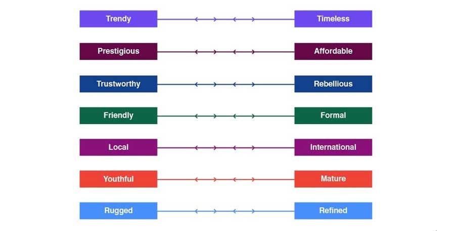
To identify the core values of your brand and masterfully convey them through colors, you may want to check out the spectrum of brand identity traits below.

Look at How Colors Influence Customer Behavior
It can be difficult to choose the right color palette for your brand if you don’t even know what kind of impression your preferred colors will produce on your audience. For this, you may want to learn more about the role of color psychology in marketing and color meanings in general.
Once you nail your brand personality, you can get around to picking appropriate colors that can best reflect this personality. There are no rules when it comes to color perception. So, you cannot say for sure what each of your clients will think of this or that color representing your company. That being said, a deeper knowledge of color meanings and symbolism will definitely help you make a wiser and more informant decision.
You should also keep in mind that the meaning of a color can change slightly or dramatically if it’s paired with another color. For example, the color blue that’s traditionally associated with nobility, aristocracy, and wisdom might appear less solemn or even become playful if combined with pink. Pink, on the other hand, might lose its inherent innocence and playfulness if combined with black or grey.
Learn from the Best
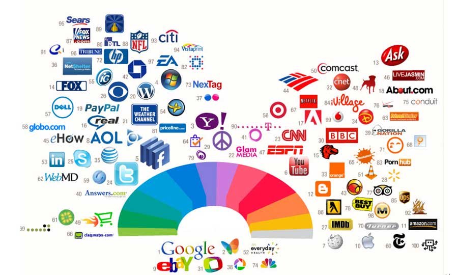
Lots of successful brands out there owe at least part of their tremendous popularity and recognition to wisely selected brand colors. So, why not explore this interconnection? If your company specializes in food delivery, take a closer look at such world-famous brands as Uber Eats, Deliveroo, Doordash, and others. You might notice right away that the majority of them opt for the color red, which is believed to increase appetite and draw attention.
What’s more, red is commonly associated with drive and power, which might hint at a company’s ability to rapidly deliver orders. If you own a sportswear company, check out Nike, Adidas, Puma, Fila, and other brands’ colors they’re using to represent their collections. No need to emulate popular brands and use the same or even similar colors! Checking out the best of the best will simply help you move in the right direction or get the required amount of inspiration from the right source!
Choose Wisely
You should identify the color you’ll be using as a core color for your brand. This will be the primary color with which your customers will mainly associate your company, as well as goods and services it offers. To make a truly effective and wise choice, once again, you need to ensure the preferred color aligns with your brand messaging and its identity. After that, you can start looking for secondary colors that can complement or add more meaning to your primary ones.
You can opt for analogous color schemes and throw in similar colors that will help create a deeper, layered effect, or go bold and have a go at contrasting color schemes. At the same time, you should never go overboard with too bright or contrasting colors not to appear tasteless. If your brand positions itself as fundamental, traditional, or serious, neutral colors might be the best bet.

